Facebook is unveiling a redesign of their website that is bold and user friendly. The new design also comes with a dark mode.
New Facebook Redesign
The new design uses a Cards design style, where different sections are contained within card-like containers.
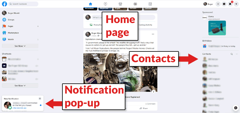 This is the main Facebook home page. Navigation is discrete and the look is uncluttered.
The top icon-based navigation are for home page, watch, marketplace, groups and gaming. Along the left you can see text based navigation for groups, pages, marketplace and watch. More features like games, town hall, events and so on are available when clicking the See More icon.
Notification Pop-up
Notifications slide upward from the lower left corner, like push-style notifications.
The top navigation is icon based. You have to hover over them to learn what they are for.

The top navigation encourages people to explore different areas of Facebook. The goal may be to build awareness of all the different things members can do on Facebook.
Facebook Dark Mode
Facebook enters the 2020’s with an up to date dark mode. Dark mode allows members to comfortably view Facebook while in a dark room.
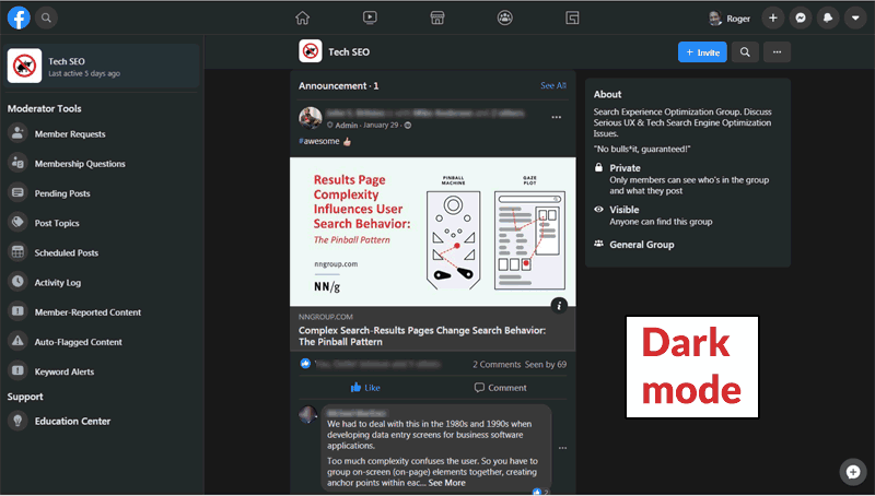
Above is a screenshot of a home page of a private Facebook group in the new dark mode. Something new and convenient are the Moderator tools on the left. Admins will see an Admin Tools section in that left hand area.
Bugs in Facebook’s Redesign
Facebook Notification Alert Bug
It kind of wouldn’t be a true Facebook experience without a bug and this redesign does not disappoint. I discovered that the notification icon does not always clear when you click the “Mark All as Read” link.
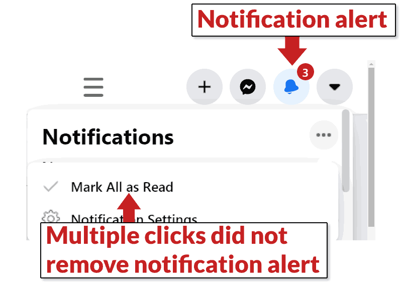
The bug didn’t happen all the time. But as you can see in the above screenshot, the notification alert icon still shows 3 unread items even though I had already clicked the “Mark All as Unread” link.
Page Jump Editing Bug
A very annoying bug happens when you click the “edit” button on a post. The screen jumps to the top of the page!
When you scroll back down to the post you want to edit, sometimes the edit button works and sometimes the page jumps back to the top of the page.
Persistent Tool Tip Bug
 This tool tip related to the isnert emoji button persisted beyond the editing screen and wouldn’t go away until I refreshed the browser window.
Another random bug involves editing buttons. After editing (presumably after briefly hovering past the insert emoji button), a tool tip popped up and persisted. Even after I finished editing and was out of the editing screen, the tool tip was still there. This bug is literally random and doesn’t happen consistently.
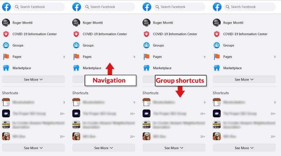 New Facebook redesign, closeup view of the left hand navigation.
The left hand navigation area expands so that more groups and Facebook features can be exposed. It’s a great way to make all of Facebook’s popular features easier to access.
New Notification Area
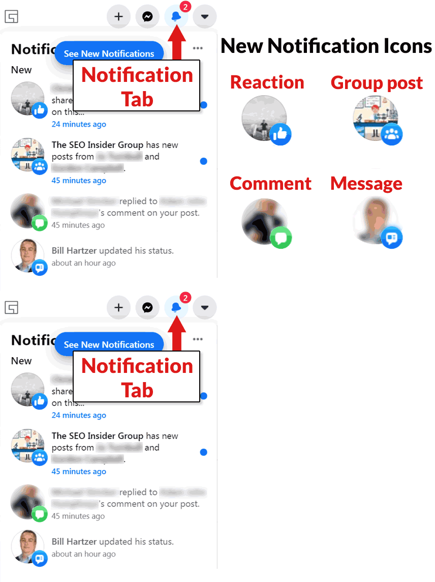 This is a close up of the notification panel area, located in the top right-hand side of Facebook’s new redesign
There are new icons to label different kinds of notifications. There’s an icon for when someone comments on your post when there’s a message, a reaction and a post in a group you follow.
Single Post Page
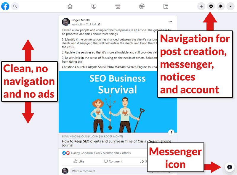
This is the layout for a page that is dedicated to just a single post. Notable is the lack of ads and no navigational elements on the left-hand side. You have to click the home page icon to get back to a page containing the left-hand navigational elements.
Facebook Advertisements are Discrete and User Friendly
Advertising resembles a regular Facebook post. It’s discrete and unobtrusive. It blends in with the rest of the page and is attractive.
Takeaways
The new layout is user friendly. It doesn’t take long to get used to the new style of navigating the site. It’s more user friendly and encourages exploration of all the other features.
For admins and moderators, Facebook has made its tools more available, which will encourage group leaders to do more with Facebook.
The advertising ad units are non-obtrusive and may provide a good user experience, which should be good news for advertisers as well as users.










![Utilizing Robotic Process Automation Solutions for Business Success 24 Businesses are always looking for new ways to work better, faster, and grow. One cool way they're doing this is with Robotic Process Automation (RPA). It's like having robots do the boring stuff so people can focus on more important work. This helps companies be more efficient, come up with new ideas, and grow even bigger. This article discusses the transformative capabilities of robotic process automation solutions and explores how such solutions enable businesses to achieve unprecedented levels of efficiency, agility, and scalability in their operations. Using Robotic Process Solutions for Business Success In the dynamic landscape of modern business, agility and adaptability are paramount. Companies that can swiftly respond to market changes, customer demands, and emerging trends are positioned for long-term success. However, achieving such agility requires more than just a willingness to innovate—it demands a strategic approach to optimizing operations and maximizing efficiency. Robotic Process Automation software plays a crucial role in such situations. By leveraging advanced software robotics to automate mundane, rules-based tasks, it empowers organizations to streamline workflows, enhance productivity, and drive growth like never before. From routine data entry and processing to complex decision-making processes, RPA solutions are revolutionizing the way businesses operate across industries. How Does Robotic Process Automation Work? At its core, RPA works by mimicking human actions within digital systems and applications. Using a combination of machine learning algorithms, natural language processing, and computer vision technologies, RPA software robots can replicate virtually any repetitive task that a human employee would perform manually. This includes logging into systems, reading and writing data, manipulating spreadsheets, and even interacting with customers via chatbots. [embedyt] https://www.youtube.com/watch?v=lNeCTzNRtUs[/embedyt] Features of Robotic Process Automation The versatility and adaptability of RPA solutions are among their most notable features. Unlike traditional IT automation tools, which are often limited in scope and functionality, RPA platforms can interact with various systems and applications, including Features of Robotic Process Automation (RPA) include: Regulatory Compliance Fast ROI User Interface (UI) Automation Drag-and-Drop Workflow Designer Screen Scraping Data Handling Learning Capability Debugging Seamless Integration Rich Analytical Suite Simple Bot Creation Interface Hosting and Deployment Options Multi-Tasking Software Console Role-based Security User-friendly Interface to Create Bots Seamless Scalability Benefits of Robotic Process Automation The benefits of RPA implementation are manifold and far-reaching. By automating repetitive tasks and processes, RPA enables organizations to accelerate their operations, reduce errors, and cut costs. Moreover, by freeing up employees from mundane tasks, RPA empowers them to focus on higher-value activities that drive innovation and strategic growth. 1. Speeding Up Processes with RPA Solutions A major advantage of RPA is its ability to speed up processes by automating time-consuming tasks that would otherwise require human intervention. Whether it's processing invoices, generating reports, or managing inventory, RPA solutions can perform these tasks with unmatched efficiency and accuracy, significantly reducing processing times and improving overall productivity. 2. Reducing Human Errors through RPA Implementation Human errors are costly and affect business performance. By automating routine tasks and processes, RPA helps minimize the risk of errors and inaccuracies, ensuring consistency and reliability in day-to-day operations. Whether it's in customer management, financial reporting, or regulatory compliance, these solutions provide a level of precision and accuracy that is unparalleled. 3. Enhancing Workflow Scalability with RPA Technology As businesses grow, so too do their operational needs. RPA technology offers unparalleled scalability, allowing organizations to adapt and expand their automation capabilities as needed. Whether it's scaling up to handle increased transaction volumes or integrating new systems and applications, they provide the flexibility and agility required to support business growth and innovation. 4. Improving Employee Productivity with RPA Solutions Automation of repetitive tasks through Robotic Process Automation software liberates employees to concentrate on activities that add value. This dual benefit not only boosts employee satisfaction and engagement but also elevates overall productivity and performance. With RPA efficiently managing routine tasks, employees can channel their efforts towards endeavors demanding creativity, critical thinking, and human judgment—fundamental elements for thriving in today's knowledge economy and driving business success. 5. Ensuring Accuracy and Governance with RPA In a climate marked by heightened regulatory scrutiny and evolving compliance mandates, precision and governance are paramount for businesses. RPA solutions deliver an unparalleled level of accuracy and control that surpasses manual processes, guaranteeing adherence to regulatory standards and internal policies. RPA also furnishes organizations with robust audit trails and reporting functionalities, empowering them to showcase accountability and transparency across their operations. Conclusion Robotic Process Automation in Business](https://biztechage.com/wp-content/uploads/2024/04/Robotic-Process-Automation-in-Business-1-120x86.jpeg)


